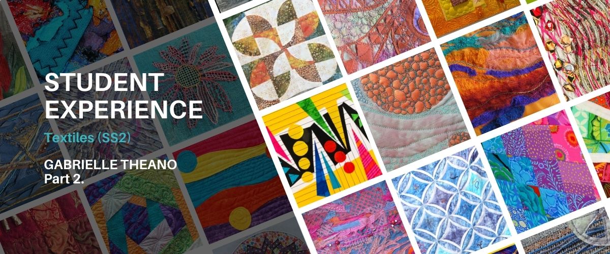
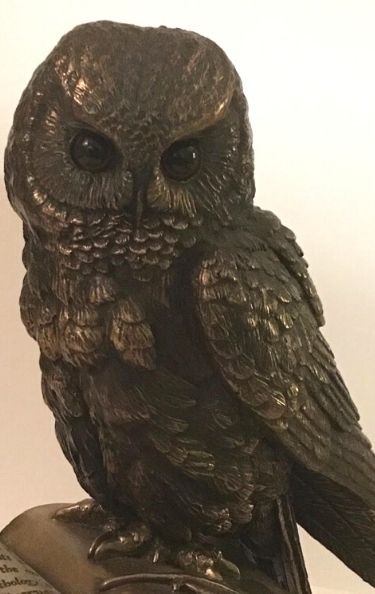
Welcome back to our special Student Experience series. This is the second part of Gabrielle Theano’s blog in which she shares the in’s and out’s of studying our accredited Textiles Course.
You can read Part 1 here, or check out the full series, and don’t forget to subscribe to our newsletter to regular updates.
Student Profile
Name: Gabrielle Theano
Course: Textiles Skill Stage 2
Previous Experience: “I trained as a scientist but I’ve been doing some form of (self taught) textile work for most of my life. I’m keen to improve my skills but also nervous. It’s been a long while since I have “put myself to the test”.
Gabrielle has already complete Module 1.
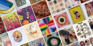
Course Overview
Our Textiles course is a mixture of Machine Embroidery and Patchwork & Quilting. The course is designed to take students through the basics and introduce them to new techniques.
By the end of the course students will have the knowledge and skill to produce pieces to a high standard which should reflect their own individual style and creativity.
Download the brochure for more information.
Module 2
Colour Theory
Running a bit late with Module 2. I realised in December that the first 6 weeks of 2021 were going to be a challenge for getting the Module done, but I admit I had hoped to be able to get going quicker. Module 2 is about using colour theory, line and texture. I’ve come across some of these ideas/tools before but it is really helpful to have it presented in an ordered way, with a clear path of development of what I am learning.
The delays at the beginning of the year meant I spent too long reading up on colour theory and its history. I particularly enjoyed Martin Kemp’s Science of Art, and Lee & Fraser’s The Rainbow Bridge. Both contain far too much detail for the module, but it was a fun rabbit hole to explore. Talking of rabbit holes – the neuroscience of vision and visual perception is huge!!
Colour theory is fascinating but it can be difficult for a novice to see how to use it in practice. I found it really helpful to examine how other artists use it, for instance to see how they use a compliment to balance a painting, or provide a focus of attention or change the mood. It is illuminating to see how a lack of variation in value can lead to a dull painting, even though when several colours are used. So, now I know that if I’m not sure of how my colour scheme is working out, if it seems a bit less interesting than I hoped, then I should try to examine the values. Luckily nowadays we can do this is easily by taking a photo and switching it to black/white, though I hope that I will be able to see it without a camera as I do more pieces/trials.
Saturation is interesting – it’s all too easy just to put the paint down from the palette, in a single saturation – usually too much. I’ve definitely noticed that more is less, and that it’s far easier to add more pigment than to take pigment away. There are few ‘solid’ colours in nature, variation of saturation, as well as hue and value are the views are eyes are treated to.
Next we had to look at line. I love line. I’m always drawn to fine, interleaved lines. As a scientist I’m drawn to its nature –an infinite number of infinitely small points. When does a line become 2 dimensional? How thick does it have to be before our eyes/brain makes that decision? Also I love the role of line in geometry –and circles. More infinity to explore. But lines don’t have to actually be drawn to provide direction or form to an image. Artists can use lines to guide our eyes to provide focus, mood, order or chaos, before they even begin to think of colour.
Texture is another tool for an artist, though we perhaps tend to think of it in terms of textile art first before painting etc. For me the texture and line are often intermixed, as I like to work in lace like sewn thread. Why are we attracted to a textured piece, even although we usually can’t actually touch it? The interplay of light and shadows, that recalls the multiple sensations of rough, smooth, dry, wet, hard or soft. How does an artist create that interplay so that our minds can virtually feel the texture?
Task 1
I was finally able to get down to Task 1 – creating and photographing small collections in blue, red, yellow and neutral colours. I was somewhat surprised to find that I don’t have many yellow or red items in my home, but have multiple hues of blue. Also – I don’t have any newspaper. A thorough dig around finally unearthed one that a friend brought back from a holiday abroad – phew. But…on no … so many coloured sections and I really was interested in some of the articles. Managed to deconstruct some pages to provide the neutral background for the photos.
This is fun – I love the interleaved plastic ties, contrasted against the smooth, geometric curves and cogs of the silver grey model. The fine threads of my stitched polyhedra provided more (irresistible) texture.
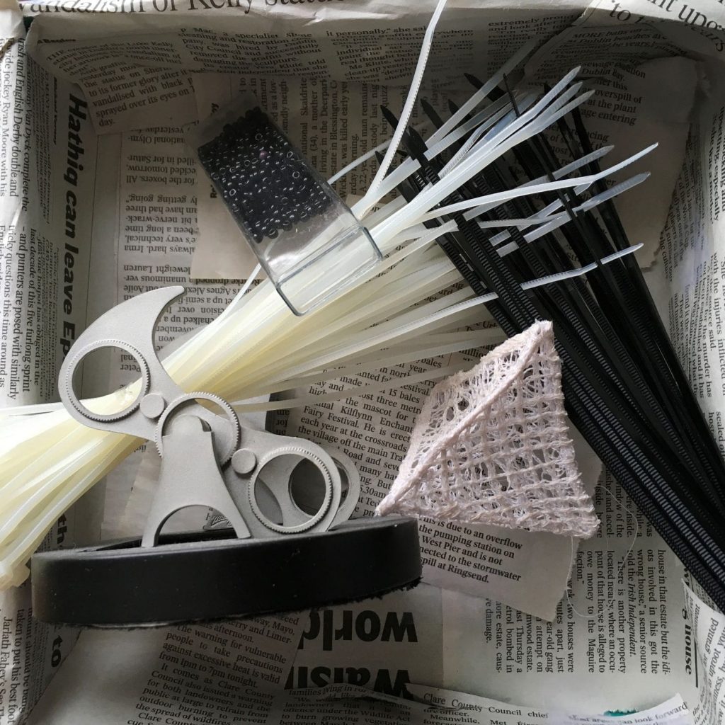
Getting the right light for the photos was tricky. The natural light into my home is great but changed too much, but totally artificial light really didn’t work either. I eventually discovered that I needed to take the photos on a bright day with some extra illumination.
Task 2
Task 2 was exploring Line. Different mediums provided an interesting comparison. I realised I had run out of ink, and don’t have the resources to obtain anymore during this Covid shutdown. But Harry Potter came to the rescue – I unearthed one of my children’s HP pen and ink set. The ink is old (both children are at University now!) and the HP nibs are a bit scratchy, but they sufficed for the task. The ink was ok for the twig as well. Thank you Harry!!
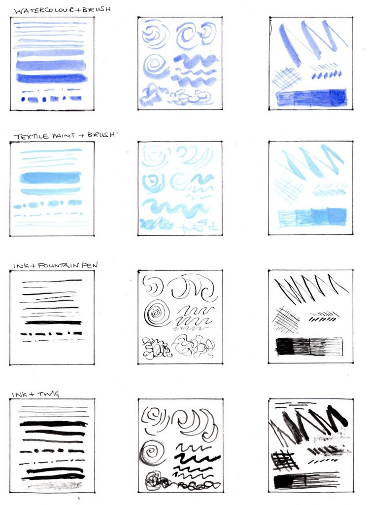
I was surprised how difficult it was to get variation in value and saturation from the watercolour brush (TomBow) pen.
Task 2 continues with depiction of emotions with line. Graphite pencil allowed me to get really mad for this, with thick, hard lines contrasting breezy carefree wisps. I did several for each emotion, I found I had to step away from them for a bit then re-examine them to decide whether they depicted my sense of the particular emotion.
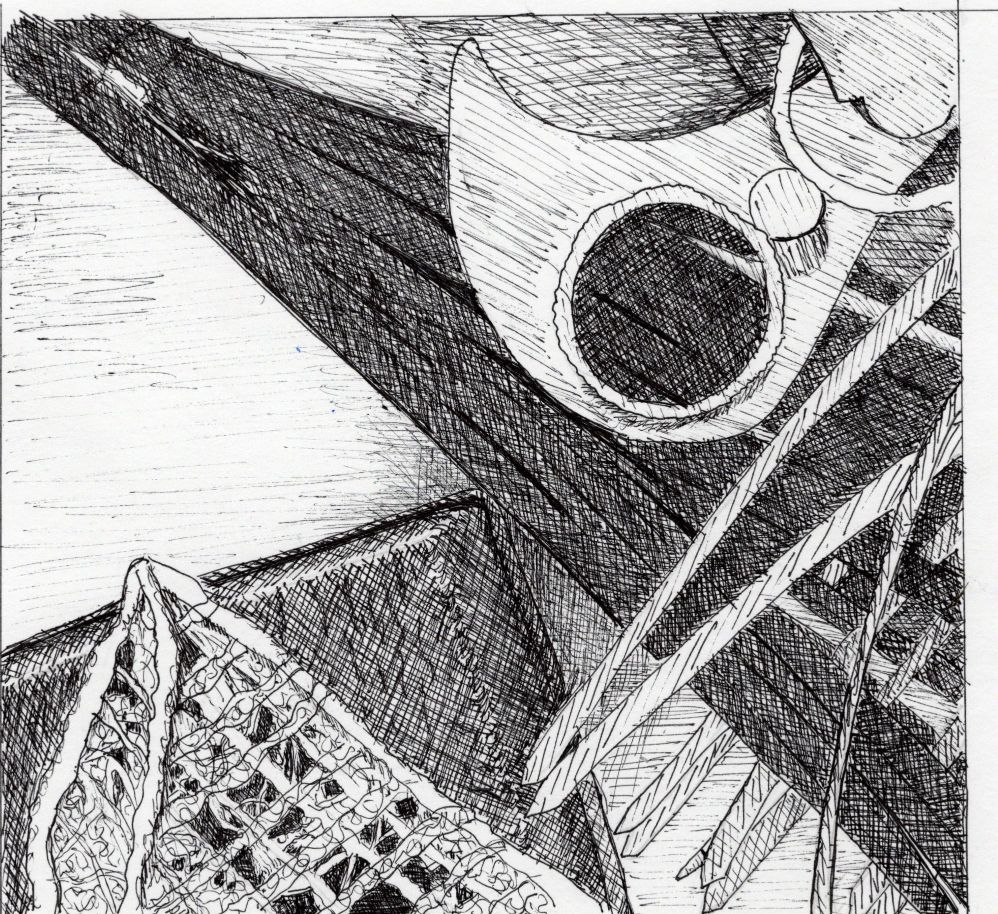
Task 3
Task 3 now – and the year is marching on! Felt a bit of panic about this but realised the best thing to do was to keep on going. I’m enjoying the module and am learning a lot. I am looking at images differently now – noticing the combinations of hues, values, the directions of line in the image etc. – all of the aspects I have studied for this module.
I was a bit daunted by the drawing requirement. I do draw sometimes, and if I’m honest, usually manage to create a reasonable image, but I never feel confident that I can do it again. I know this means I should practice more often, but I never seem to. But the task is more about the effects of different mediums, so I should perhaps not worry too much about my lack of drawing skills.
I had trouble with the pencil image – the initial frame I used was a rectangle, which I was trying to squeeze into a square image space. I modified my frame to a square, which made life much easier! I was really pleased with my gel pen version.
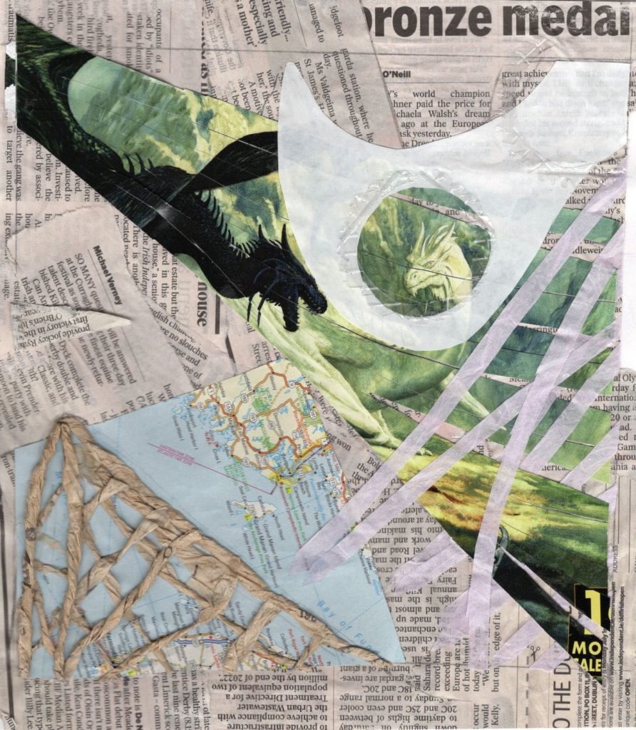
Task 4
The final task(4) is three collages – using recycled stuff. I have coloured and textured papers for art work but my apartment is small, so I don’t end to keep waste stuff around. But I knew I had some old map books that I don’t need anymore (thank you cell phones), there was last year’s shiny, smooth calendar, napkins, freezer paper remnants, and I’m never far from a Tunnocks teacake. An old dress pattern, which I’m definitely not going to use again, provided a really lovely sculptural medium, and I noticed the discarded torn edges from one of my sketchbooks in my recycle bin. A (now finished) biscuit packet gave me textured plastic and a corrugated liner. I had more than I thought. I am amused/amazed how the dragons came out, as I cut out the shape from the back.
Finally finished the module tasks and the photos. At one point I wondered whether I’d get it done – it was one of those moments when one has to take a huge breath and get on with it. SoST is very supportive and I knew they would not mind if I had to delay, but I’m eager to continue. I’m learning so much, and having fun at the same time. I already feel that my own work will be better, even from what I have done so far. At the very least I will have a more structured way of examining it, including doing samples in other mediums. I’m looking forward to learning more.